
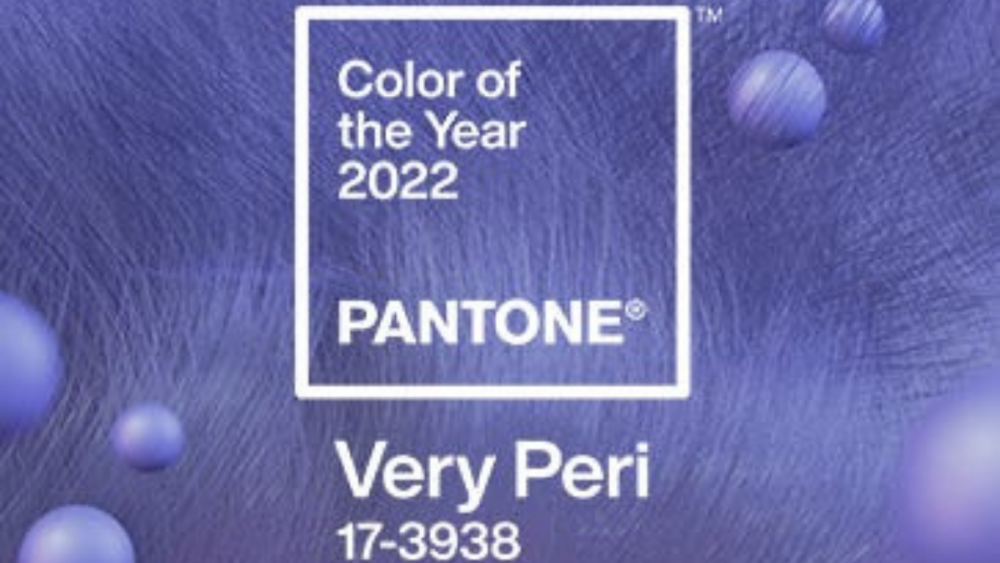
Finally, Veri Peri, Pantone’s Colors of the Year, and a color that I find to be fun, amusing, cool, crisp, refreshing, and an invitation to a fresh start after a Pandemic year in at times gloomy grey tones and yellowish highlights and undertones.
Always loving colors, I find it engaging and exciting to see changes and having the wonderful challenges the color trends bring to fashion. Regardless of how we bring palettes of colors into the scheme of things, trends will always have a hand in how we visualize vignettes, no matter the vision.
Yes, of course, we chose our color schemes and palettes wisely and carefully, with vision and artistic valor. Thus, many times the color of the year, is simply that—and we don’t necessarily pivot in that direction in order to satisfy our visual satisfaction, nor feed into the trending frenzy.
However, I feel we all need direction from the professional colorists that live and breathe these colors that are developed for that particular year. Many jokes are made in the industry on how these colors come about, including statements like, “Hey, they probably have a color chart on the wall, and throw the proverbial dart, and where it lands is where the color gets picked from!”
Here’s what said Laurie Pressman, vice president of the Pantone Color Institute, had to say: “Named Very Peri, the color is a blend of blues combined with a violet-red undertone that produces a dynamic periwinkle shade—a creation that’s intended to symbolize the transformative year we’ve had, and a new perspective looking ahead. Creating a new color for the first time in the history of our Pantone Color of the Year educational color program reflects the global innovation and transformation taking place,”
The international authority on color trends noted that this shade is meant to reflect the digital world’s growing impact at a time of pandemic-heightened isolation.
The particular shade of blue infused with ultra-red is meant to emulate the essence of glowing screens and gaming, which merge the digital world and our physical lives.


“With trends in gaming, the expanding popularity of the metaverse and rising artistic community in the digital space, Very Peri illustrates the fusion of modern life and how color trends in the digital world are being manifested in the physical world and vice versa,” the company’s release stated.
So in 2022, let’s take a moment to realize where we are, enjoy it, and get energized for a new year. After the challenges that 2021 gave us, we all deserve it.
Daniel M. Guelbart is a leading expert on luxury outdoor furniture. With over 40 years of experience in sales and marketing, he is still as passionate as ever about showcasing best-in-class design. For more information, a list of Daniel’s vendors, or to get in touch, visit www.danielmguelbart.com.